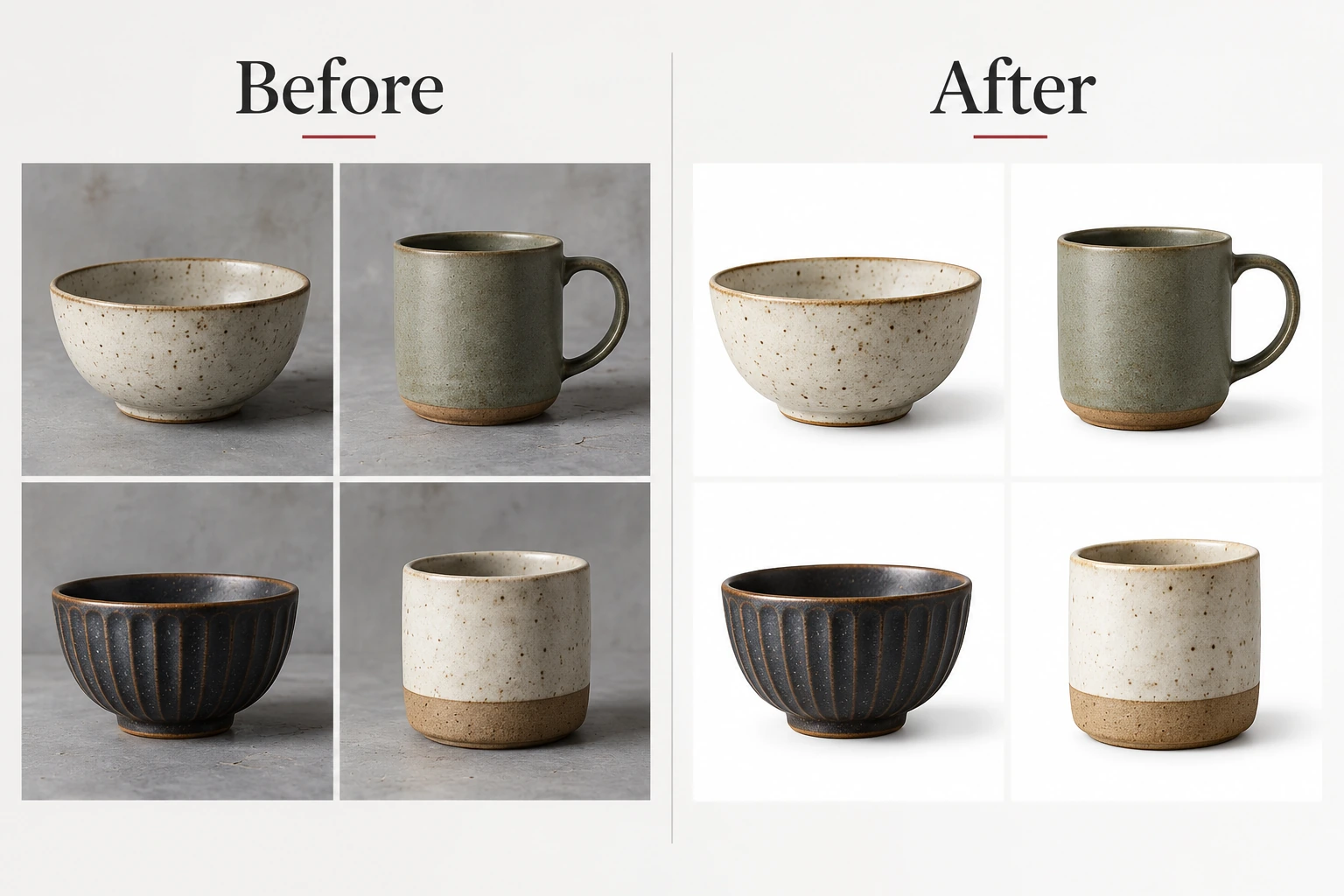
Graphics Design
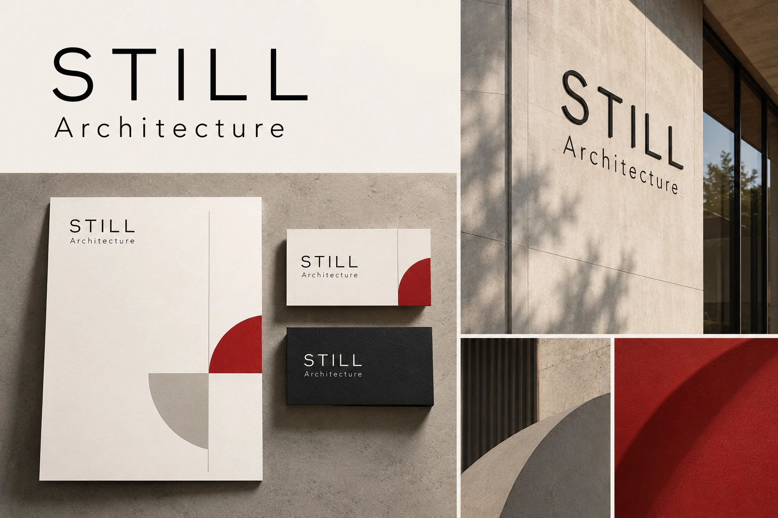
Buyers decide whether you are serious within seconds of seeing your brand. Good design does not make that judgement go away — it just makes sure it lands in your favour, in every place a customer meets you.
The usual problem is not an ugly logo, it is inconsistency: three versions of the mark, four shades of your colour and two fonts, so nothing feels like one company and therefore nothing feels established. I fix that with a complete system rather than a single file. Primary logo, horizontal and stacked lockups, an icon-only mark and single-colour versions for stamps, embroidery and signage. Colours specified in HEX, RGB, CMYK and Pantone, a typography scale, spacing rules, clear space and do-not-do examples, so anyone can stay on brand without asking you.
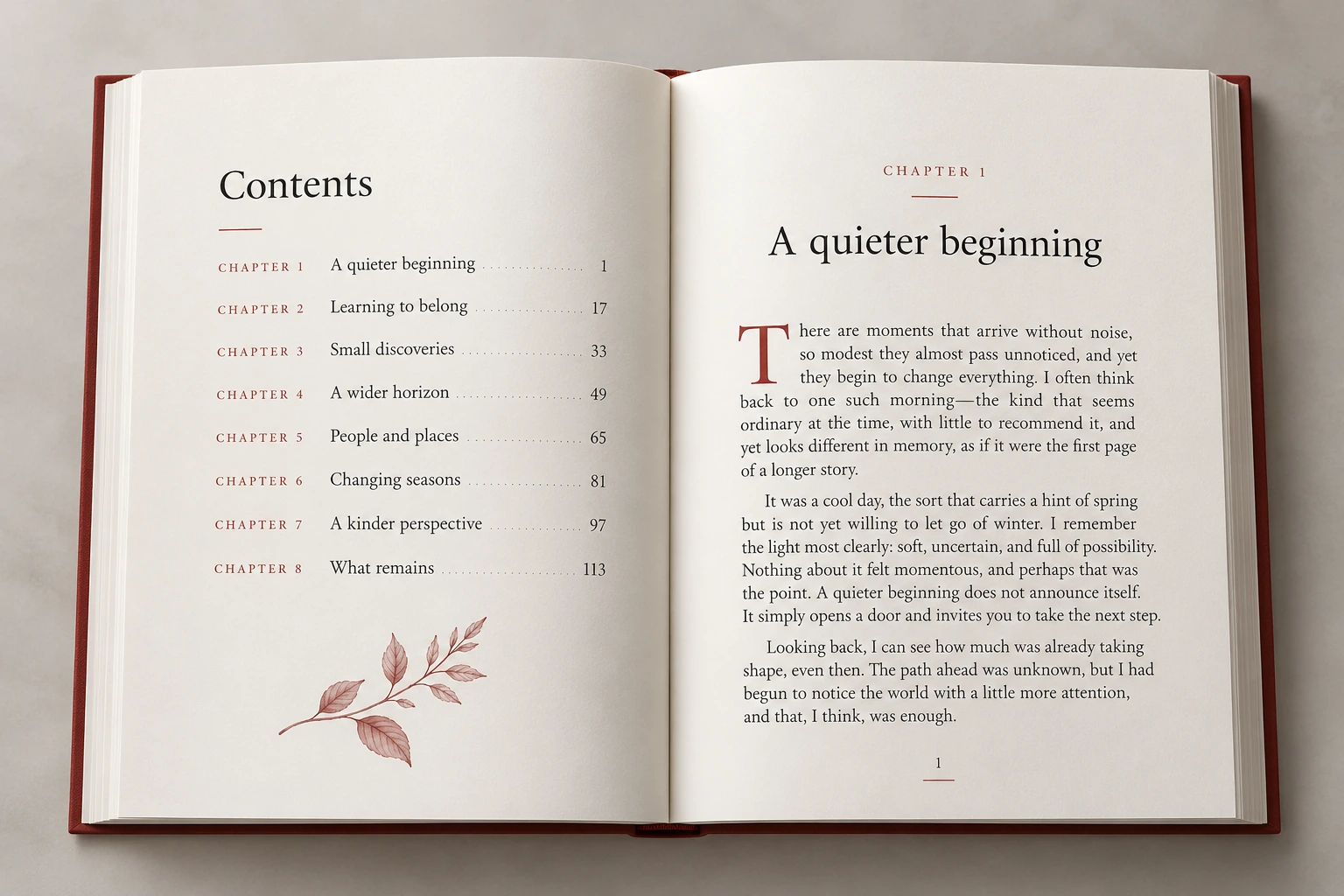
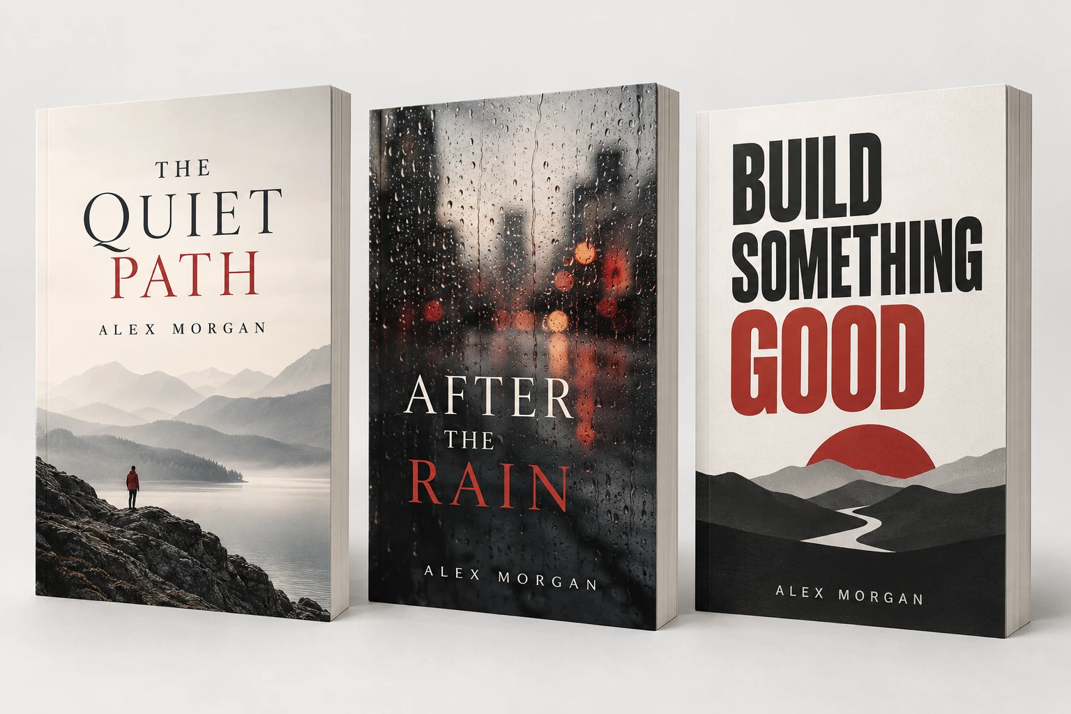
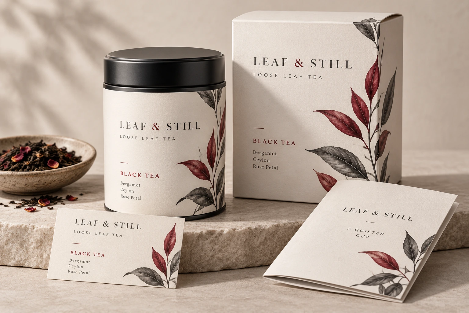
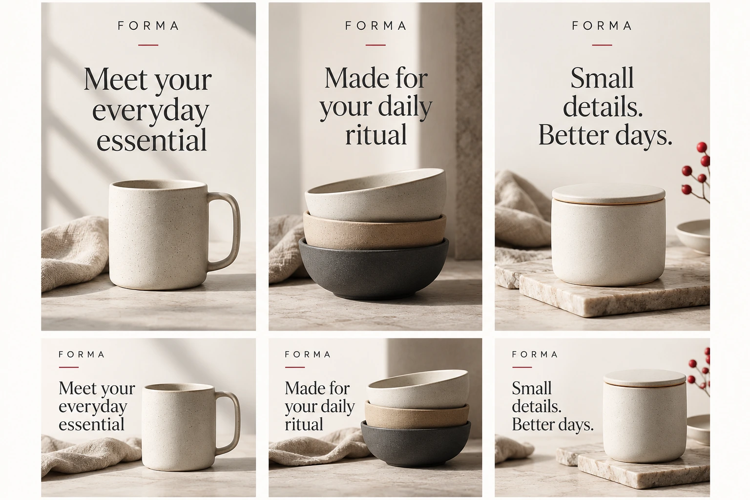
Every concept is presented in context — on signage, packaging and a phone screen, where it actually has to work — rather than floating on a white square. Print collateral is set up with bleed, crop marks and CMYK conversion so the press runs without a panicked phone call.
You get vector source files, exports in every format and full commercial rights, plus editable templates for the pieces you reproduce weekly so routine design stops costing you a brief every time.